News Center
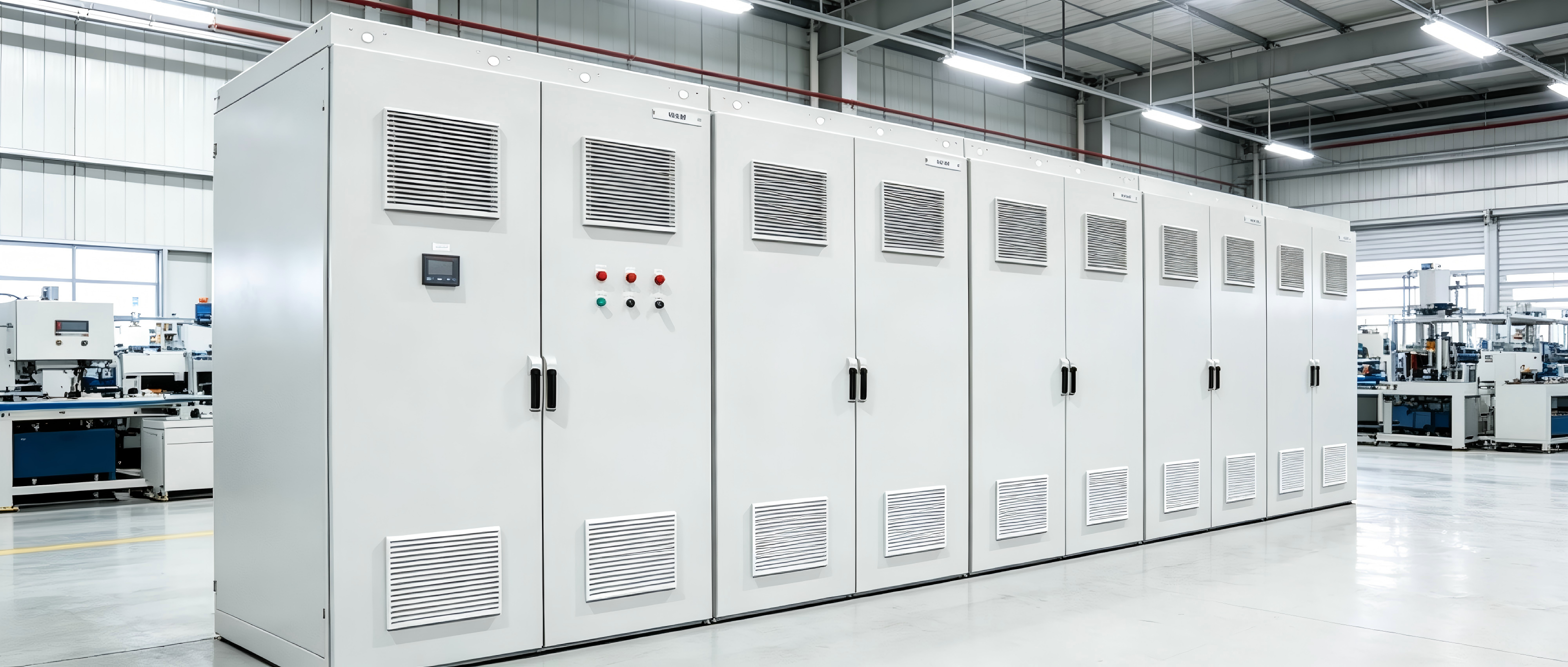
Understanding UL 508A and U.S. Compliance for Industrial Control Panels
Who is this guide for? This guide is intended for anyone who specifies, purchases, or installs industrial control panels for the U.S. market — including
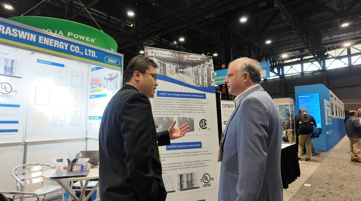
Infraswin Energy debuts at 2026 IEEE Show, UL891 and UL508A cabinets draw North American attention
From May 5 to 7, 2026, Shanghai Infraswin Energy Co., Ltd. participated in the IEEE International Exhibition on Power Transmission and Distribution Equipment and Technology held in Chicago (Booth No. 2987).
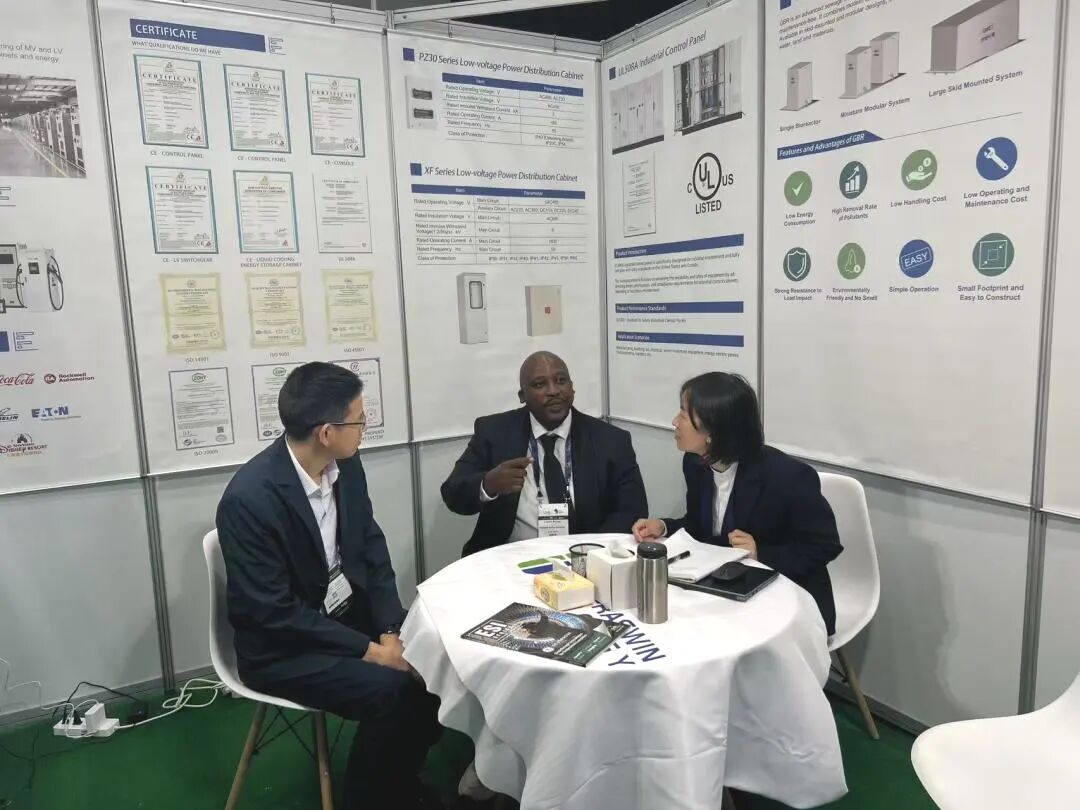
Infraswin Energy Shines at Enlit Africa 2025: Innovative Technology Leads the Future of Energy
From May 20 to May 22, 2025, Infraswin Energy showcased its latest Integrated Smart Energy Solutions at the Enlit Africa 2025 exhibition in Cape Town, South Africa. At the event, Infraswin Energy presented cutting-edge technological achievements and groundbreaking product solutions, highlighting the company's leadership in the energy sector and providing a high-level platform for global partners to engage in in-depth exchanges and collaborative innovation.

Lean Production in the Workshop: Efficient Integration of 6S Management and the '6 NoGo' Principles
In today's highly competitive manufacturing environment, improving production efficiency, reducing costs, and ensuring quality have become critical for corporate survival and growth. Shanghai Infraswin Energy Co., Ltd. has significantly enhanced workshop management by effectively integrating 6S management with the '6 NoGo' principles, creating an efficient, orderly, and safe production environment.
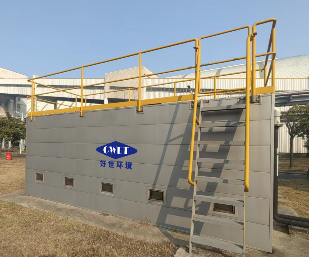
GBR High-Efficiency Bioreactor: A Powerful Tool for Domestic Wastewater Treatment
As urbanization accelerates, domestic wastewater discharge has become increasingly serious. How to treat it effectively has become a pressing challenge. Today we introduce a powerful tool in wastewater treatment: the GBR high-efficiency bioreactor using biofilm technology.
- 1
- 2
- 3